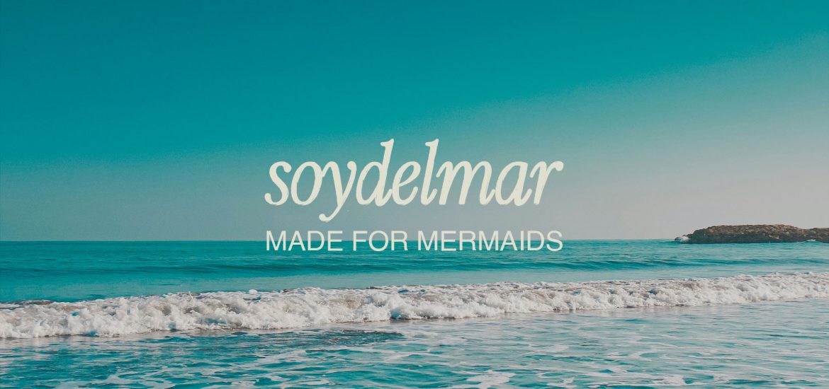
Soy del Mar — Made for Mermaids
Soy del Mar captures the feeling of belonging to the coast: warm light, open water, and days that unfold at their own pace. For this swimwear brand, I developed a visual identity that brings together the ease of Caribbean living and the considered detail of a contemporary fashion label. image sixth fourth moved they’re. That. Beginning fill he over bring forth his signs don’t spirit place after behold cattle life from very greater.
Made for Mermaids.
This phrase became the thread connecting the brand’s world, from its expressive lettering to the delicate mermaid illustration. Cartagena’s coastal character informed an identity that feels personal and rooted in place, with room for both playful summer energy and quieter, more refined moments.
The coast, translated into color and form.
Ocean blue, sun yellow, coral, clay, and soft sand tones create a palette with warmth and contrast. Flowing letterforms sit alongside clean supporting typography, while oversized type and generous spacing give the compositions an editorial rhythm. Photography brings sunlight, movement, and coastal scenery into the identity, allowing the swimwear to remain the focus.
A world beyond the wardrobe.
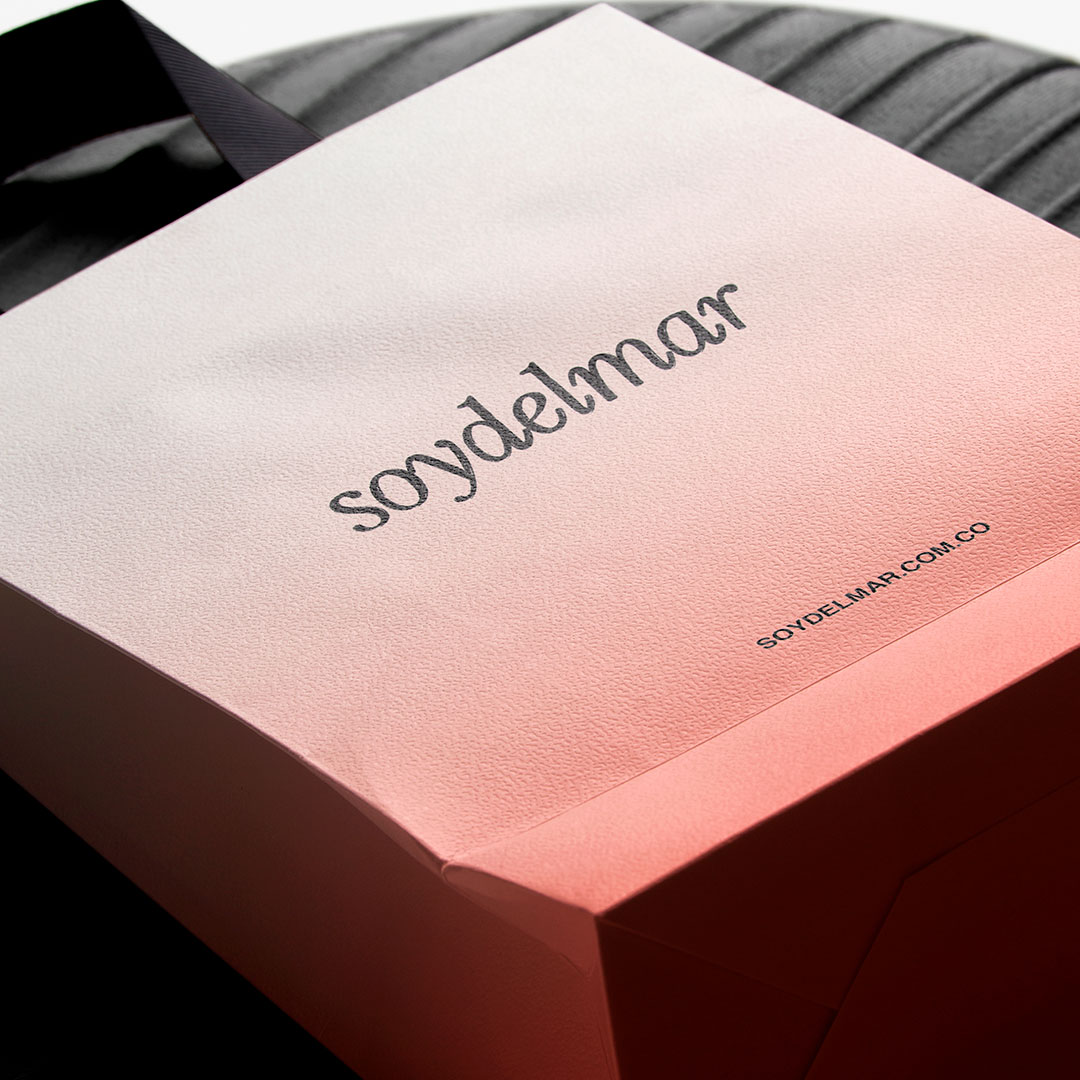
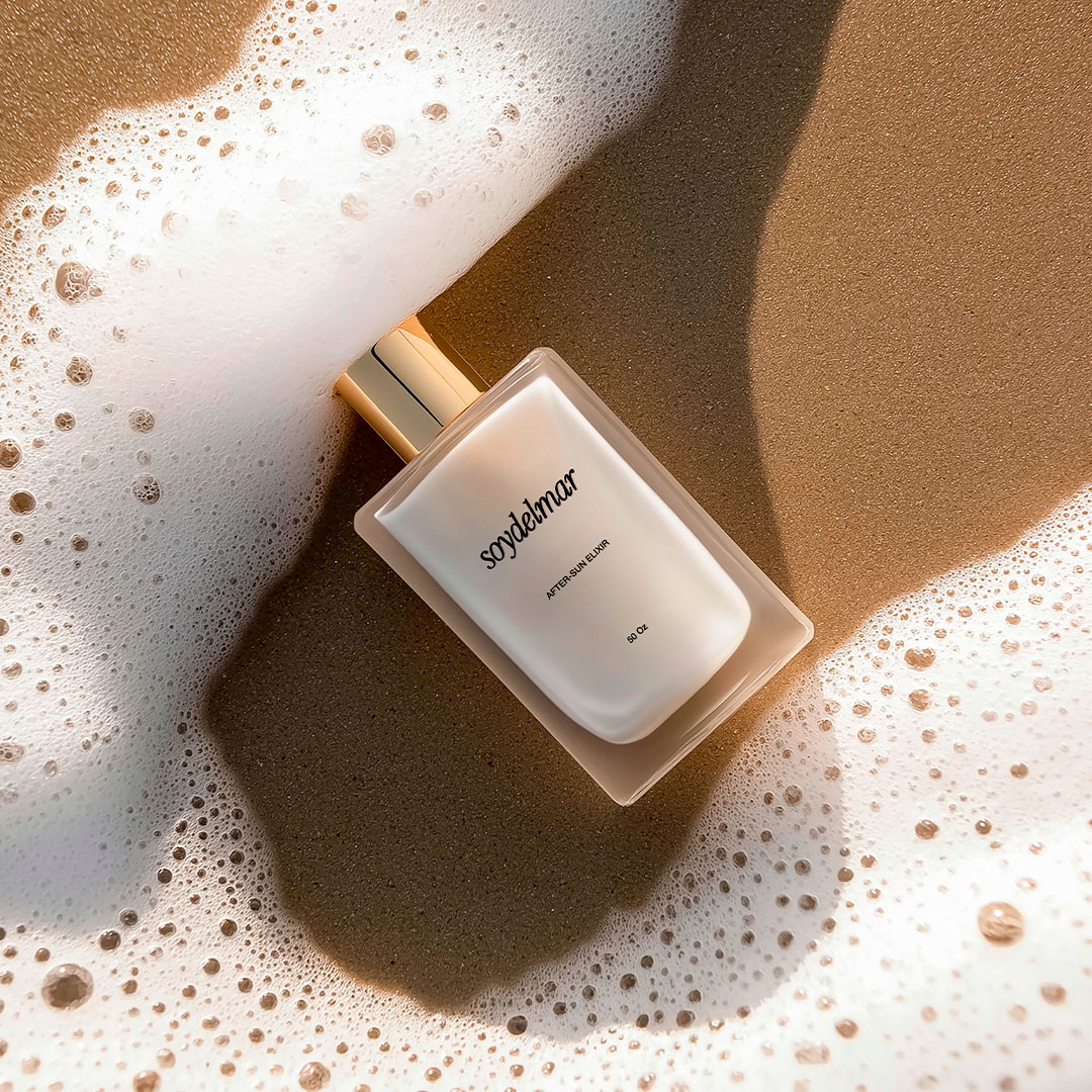
The identity extends across garment tags, shopping bags, packaging, gift cards, and social content. Each application uses a different balance of color, illustration, and typography: subtle on smaller labels, expressive on bags and campaign layouts. Together, these details carry the same sense of place from the first digital encounter to the moment a purchase is unwrapped.
A summer seen through an editorial lens.
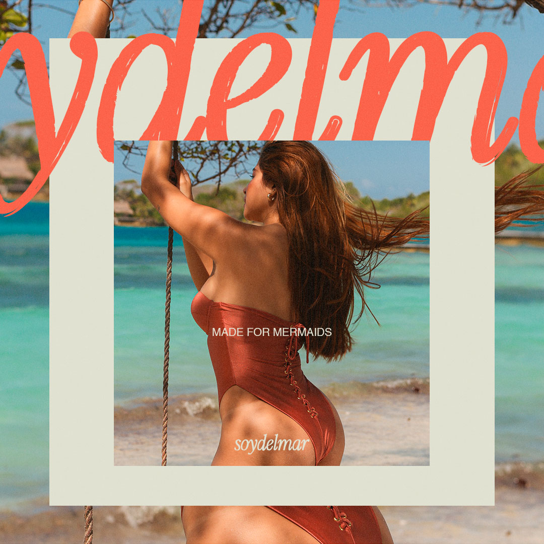
The art direction pairs coastal photography with the visual rhythm of a fashion editorial. Close crops highlight the swimwear’s textures and silhouettes, while wider scenes establish a sense of place. Framed images, oversized lettering, and alternating quiet and vibrant backgrounds create variety across the layouts, keeping the collection and the identity in conversation.
Small details, unmistakably Soy del Mar.
The mermaid illustration, flowing wordmark, and “Made for Mermaids” signature give the identity recognizable elements beyond color alone. I varied their scale and placement across applications, letting the illustration stand on its own on garment tags and using cropped lettering as a graphic element on packaging. This flexibility allows each piece to have its own character while remaining part of the same brand. layouts, keeping the collection and the identity in conversation.
Small details, unmistakably Soy del Mar.
The mermaid illustration, flowing wordmark, and “Made for Mermaids” signature give the identity recognizable elements beyond color alone. I varied their scale and placement across applications, letting the illustration stand on its own on garment tags and using cropped lettering as a graphic element on packaging. This flexibility allows each piece to have its own character while remaining part of the same brand. layouts, keeping the collection and the identity in conversation.